5 Retail Design Tips for an Elevated Retail Store
Do you struggle to find ways to inspire customer purchases every time they enter your beautiful retail space? As a retail store owner, you know that creating a captivating and exceptional shopping experience is essential to keep your customers coming back and new customers coming in It may seem challenging to achieve, but with a curated environment, strategically placed displays, and a seamless layout, you can actually create an attractive and extraordinary shopping experience for your customers.
Our NOLA Designs team understands the importance of designing a retail space that reflects your brand and reaches the right audience for your business. As a boutique interior design agency that specializes in creating beautiful retail spaces for female-owned brick-and-mortar stores, we know how to bring a unique touch to each project we work on. We are dedicated to helping small business owners like yourself achieve an elevated store that inspires your customer, so that your retail space stands out, creating a modern, clean, warm, and chic shopping experience that you and your customers will love.
If you are a retailer trying to level up your store and looking for tips that will actually work, this article is for you, so keep reading!
Tip#1: Define your brand identity
Your brand identity is the foundation of anything you create. When considering ideas for your business, always ask yourself: Does this align with your brand values, aesthetics, target audience? Do the colors and materials match your brand? Consistency and cohesiveness are key in design decisions. If any ideas don’t align, it’s time to reconsider. If you haven't had professional branding done, we strongly encourage you to make that investment, because it is the core of your brand image and your customer connection.
Tip#2: Create an inviting entrance
The entrance of your store sets the tone for the entire shopping experience, and only an inviting entrance will entice customers to actually step inside. Pay attention to the storefront design - does it reflect your brand’s uniqueness? Make sure you are using eye-catching signage and beautiful window displays to pique curiosity and draw people in for a closer look. Also, consider the exterior, don't overlook the importance of your store's exterior. Make sure the entrance is well-maintained, clean, and visually appealing. You can add potted plants, welcoming signage, or attractive outdoor seating arrangements to create a pleasant atmosphere.
Tip#3 Optimize your store layout
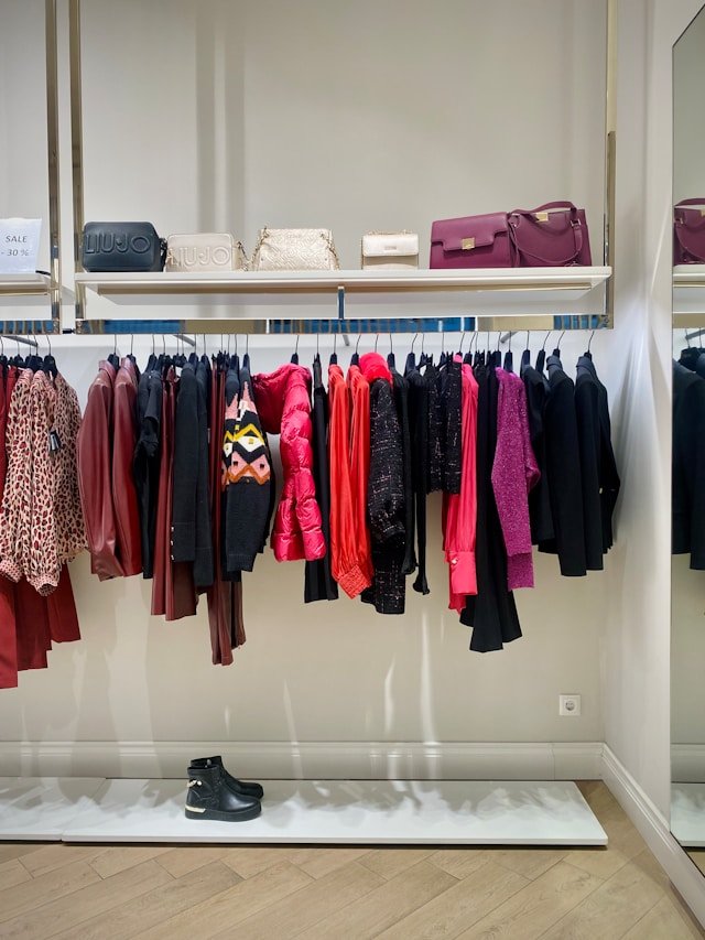
An open and well-organized layout is a must! An unorganized store deters customers for walking through the door, so you need to avoid clutter and overcrowding. A clean and organized display gives the impression of a professional and inviting store. Consider the flow of customer traffic and strategically place high-demand and best-selling items near the entrance to grab your clients' attention. You should also consider creating designated sections for each category instead of mixing them all together as this will make it easier for your customers to find what they are looking for. Surely, you don’t want them to miss anything, so use signage when necessary. You can add signage above your display (on the walls) or on the displays themselves.
Tip#4: Make lighting your best friend
The often underestimated hero of retail design. If you’ve been following NOLA for a while and reading all our blog posts, you know we talk about lighting A LOT! But you know what? Lighting really is important. Lighting enhances product visibility and presentation. Adequate and well-designed lighting ensures that products are properly illuminated, making them more visually appealing to customers. It allows shoppers to see the details, colors, and textures of the products, which can influence their purchasing decisions. Effective lighting can highlight the key features and benefits of the products, making them more enticing and desirable. Also, even if you have the most efficient layout and stunning decoration, none of this will matter if you don’t use the right lighting to create a warm and inviting ambiance. Experiment with different lighting types to evoke different moods and draw attention to any specific displays or products you wish to get featured. We strongly discourage the use of fluorescent lighting as it can give a space an inexpensive and discount store-like appearance.
Tip#5: Prioritize comfort and convenience
You want your customers to feel comfortable when browsing through your store. Incorporate elements of comfort in your store with seating areas that include soft seating options that are ergonomic. When incorporating seating, ensure that aisles are wide enough to accommodate strollers and/or shopping carts. You can also consider diverse types of seating areas like a quiet corner for reading or browsing, communal seating area for interaction. Depending on the space available in your store and the nature of your products, you may even consider adding a refreshment station for a touch of hospitality and other amenities like free wifi, charging stations, reading material to top it off! Regardless, your focus should be to try to accommodate your customers the best way possible to make their shopping experience as comfortable and convenient because this encourages them to spend more time in your store.
We hope that a bit of our expertise that we have shared with you in this blog post, has helped you and provided you some ideas to help you create an elevated and functional retail environment. With a carefully crafted brand identity, inviting entrance, optimized layout, strategic lighting, and a focus on customer comfort and convenience, you will be a few steps ahead already.
But if you feel like you still need professional help, learn more about NOLA Designs and our approach to retail design
