Do Your Store Displays Overwhelm Customers? Here’s How to Improve Them
In retail, your store's appearance can make or break a sale. Cluttered displays discourage shoppers, making it hard to navigate and engage with products. Striking the right balance between stocking enough and avoiding excess is key. Contrary to popular belief, more products don't always mean more sales. Effective product density management is crucial. A well-organized, visually appealing store enhances the customer experience and boosts your brand image.
Human Behavior and Perception
Humans are naturally vision-oriented, processing images much faster than text. In today's fast-paced world, shoppers' attention spans are shorter—it takes about six seconds to find a specific brand before moving on. Retail displays cater to this behaviour by allowing shoppers to quickly understand a product's benefits. Creating displays that tell a story or demonstrate the product in use can engage customers emotionally and make your store more memorable.
Creating Effective Focus Points
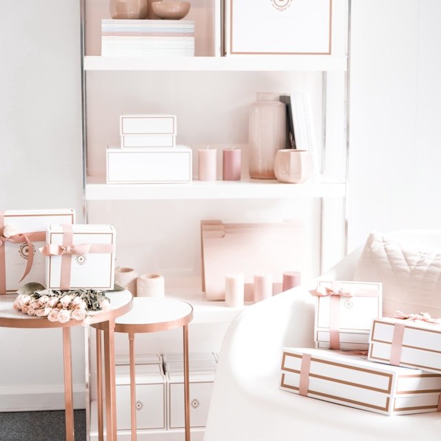
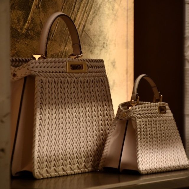
An overcrowded store can be uninviting. Consumers associate open spaces with higher value, so avoid overstuffing shelves and racks. Instead, strategically arrange merchandise to optimize visibility, accessibility, and customer engagement. Ensure products are easily accessible and visible, with adequate spacing that allows customers to browse comfortably.
Rather than overloading your shelves, restock small amounts of your product more often. This keeps display racks full but not too full, balancing the need for availability with the desire for a neat appearance.
Utilizing Empty Spaces
Empty spaces can be just as crucial as filled ones. When retailers reduce the number of choices in front of the customer, decision-making becomes easier. Use versatile shelving systems that allow for adjustable heights and depths, catering to different product sizes. This creates a dynamic layout that can be easily modified, ensuring the display remains fresh and accommodates seasonal changes or varying inventory levels.
Managing SKU Amounts
Managing the number of different products, or Stock Keeping Units (SKUs), in your store is crucial for maintaining an organized and appealing display. SKUs are unique identifiers for each product. Too many SKUs can make your store feel cluttered, while too few can leave shelves looking sparse. Aim for a balanced approach by regularly reviewing sales data to determine which products are popular and which are not. Reduce the number of SKUs for slower-moving items to free up space for bestsellers, and group similar items together to make it easier for customers to find what they're looking for.
Inventory Control
Like managing SKUs, effective inventory control is vital for preventing overcrowding. Regularly review sales data to understand which products move quickly and which linger, leading to overstocked displays. Implement a first-in, first-out (FIFO) system to ensure older stock is sold before newer items, keeping displays fresh and reducing excessive backstock.
By carefully managing inventory levels, you can optimize shelf space and maintain an appealing display. This not only improves the customer experience but also reduces the stress of dealing with unsold inventory.
Making the Most of Vertical Space
Utilizing vertical space is essential for maximizing shelf capacity without overcrowding. Install shelves that reach up towards the ceiling, and use the higher levels for stocking lighter or less frequently purchased items. This strategy not only increases your display area but also draws customers' eyes upward, making the store feel larger.
Ensure all items are accessible, either by staff assistance or with tools like step stools. Expanding upwards allows you to showcase more products without sacrificing the neatness of your retail environment, providing a solution for small spaces with high inventory.
Group by Category
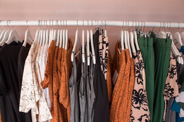
Organize products by type and then by specific attributes such as colour, size, or style. For example, in a clothing store, group all apparel together, then further categorize by type (e.g., shirts, pants, dresses) and then by style or season (e.g., casual, formal, summer, winter). Additionally, within each type, arrange items by colour to create a visually appealing and easy-to-navigate display. This makes it easier for customers to find what they're looking for and enhances the overall shopping experience. Logical organization not only helps customers quickly locate their desired products but also encourages them to explore related items, potentially increasing sales.
Incorporating these elements into your visual merchandising strategy can transform your retail space, making it more inviting and efficient. By focusing on understanding human behaviour, creating effective focus points, utilizing empty spaces strategically, maintaining optimal inventory control, and maximizing vertical space, you can enhance the shopping experience and drive sales. Learn more about NOLA Designs and our approach to retail design! We specialize in crafting spaces that not only look modern but also perform exceptionally well, ensuring your store stands out in a competitive market.
