Steering Clear of Common Store Layout Mistakes in 2024
We're about to spill the beans on the stuff they don't teach you in Retail 101. Ever wonder why some stores hit the jackpot while others miss the mark? It's not just luck – it's all in the layout! In this blog post, we're sharing about the things nobody tells you: the factors that mess with your store experience, the moves to amp up your layout game, and, of course, the cringe-worthy mistakes that some retailers unknowingly make. So, whether you're a retail pro or just starting out, buckle up for some real talk about the mistakes to dodge and the wins to grab when it comes to crafting that perfect store layout. Let's make sure your store is a hit, not a miss!
Wrong Floor Plan
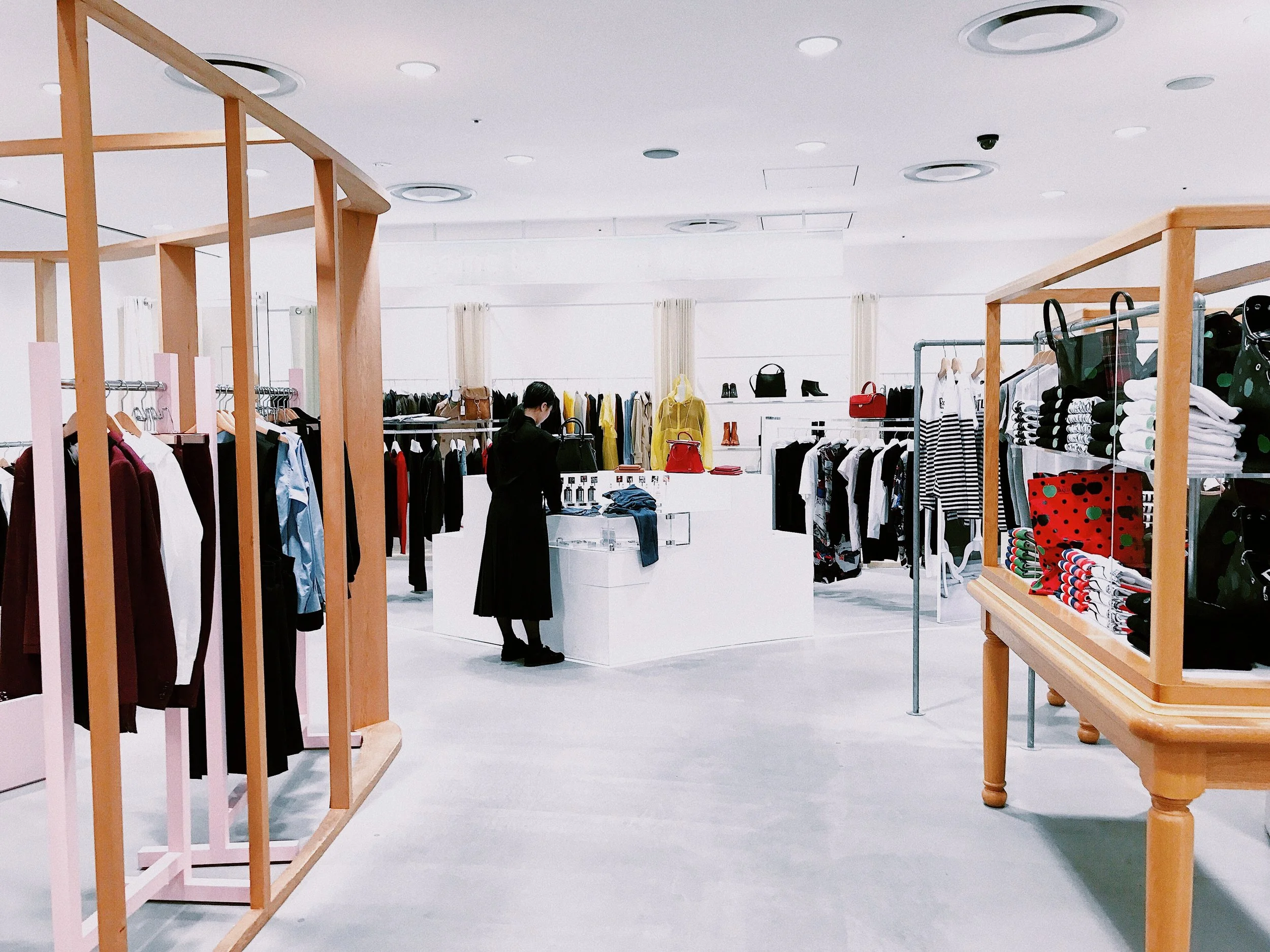
Your store's floor plan, the fundamental design dictating customer flow and product interaction, plays a pivotal role in its efficiency and appeal. Opting for the wrong floor plan can render your space inefficient, inconvenient, and unattractive, impacting sales and conversion rates. To avoid this, choose a floor plan tailored to your store's size, shape, and objectives. Grid, loop, free flow, and mixed layouts each have their pros and cons, depending on product type, customer behaviour, and merchandising strategy.
The significance of a well-suited floor plan becomes evident when considering customer expectations and purchasing behaviour. Studies indicate that in North America, customers tend to instinctively veer to the right upon entering a store, while in Britain, Australia, and Japan, the opposite holds true. Although not an exact science, understanding these patterns is essential for optimizing customer navigation and product exposure.
Failing to Design a Clear Path
Guiding customers through your store with a logical layout is crucial. Ensure your customers have ample space to navigate, particularly if they tend to veer to the right. This not only enhances the likelihood of a purchase but also regulates the flow of traffic, preventing congestion and ensuring a seamless shopping experience.
A lack of a clear path can lead to traffic build-ups, hindering the customer experience and potentially causing them to leave without exploring your full range of merchandise. Choose a layout that aligns with your business type, store size, and operational goals to meet customer expectations and enhance their overall experience.
Cluttered and Disorganized Spaces
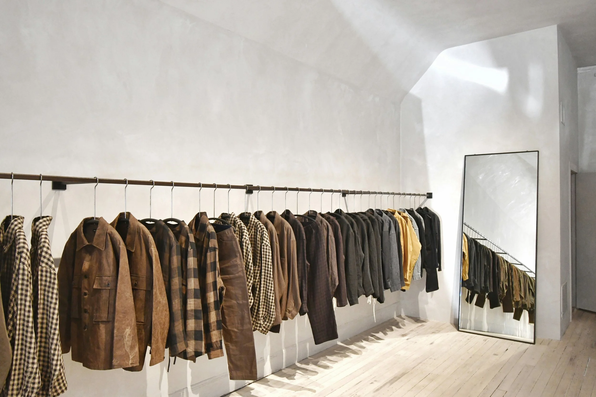
Avoid the mistake of cluttering your space with excess merchandise or fixtures. A cluttered store appears messy, disorganized, and uninviting, making it difficult for customers to browse and shop comfortably. Adhering to the principle of "less is more" by maintaining simple, clean displays with adequate spacing fosters a sense of order and ease for customers.
NOLA Designs ensures clear pathways, a modern layout, and well-fitted fixtures in all client projects. A clutter-free and well-organized space facilitates easy navigation, ensuring customers can focus on exploring your merchandise instead of getting lost in a maze.
Navigation Challenges
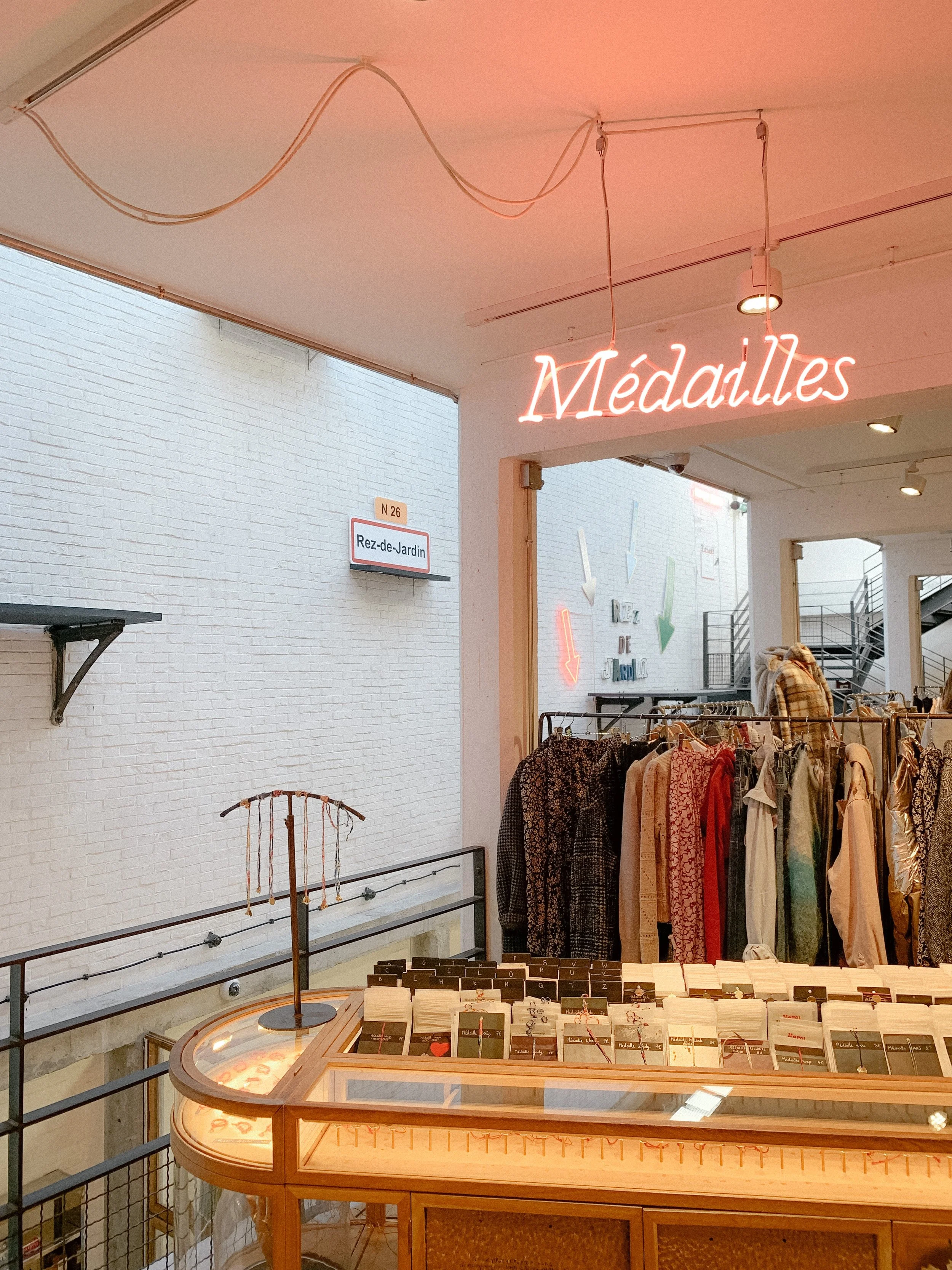
A store that is challenging to navigate can frustrate customers, distracting them from their shopping goals. Emphasizing logical floor plans and effective navigation signage reduces stress, promotes convenience, and fosters customer loyalty. Balancing retail space is essential, allocating display space based on inventory, price points, and product management capabilities.
Ignoring Customer Complaints
Neglecting customer feedback is a common mistake. Valuable insights from customers can help refine your store layout and overall experience, potentially boosting sales and loyalty. Regularly solicit feedback through surveys, interviews, focus groups, mystery shopping, or social media, and use the information to implement positive changes.
Poor Sightlines
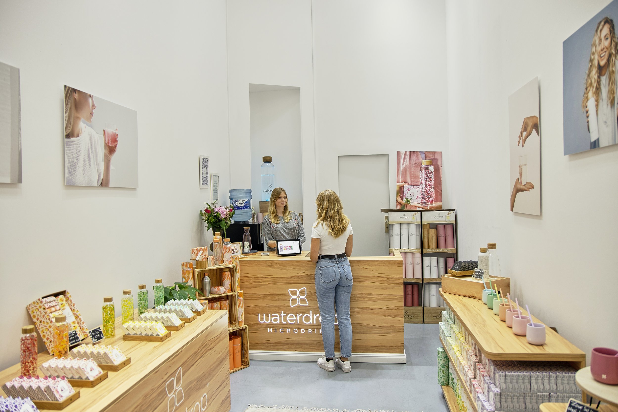
Ensure customers have a clear view upon entering your store by avoiding tall displays or poorly placed aisles. Strategic placement of displays at eye level and maintaining relevant products along sightlines improves the customer experience. Overcrowded aisles can be overwhelming, discouraging impulse buys. Opt for appropriately sized displays to maintain comfortable traffic flow and enhance the shopping experience.
Neglecting Accessibility
Consider accessibility when planning your store layout to ensure inclusivity. Wide entrances, clear pathways, and obstacle-free spaces create an environment accessible to all customers.
Not Relying on Retail Design Experts
Recognize the importance of relying on retail design experts, like NOLA Designs, to steer clear of common store layout mistakes. These experts can guide you through the entire process, from initial consultation and planning to interior design, construction, and project completion. Avoid the pitfalls of a DIY approach and collaborate with retail fit out experts for a clutter-free, attractive, and accessible retail environment that both you and your customers will appreciate.
