Nola Inspo : Get the "Neutral Chic" Look
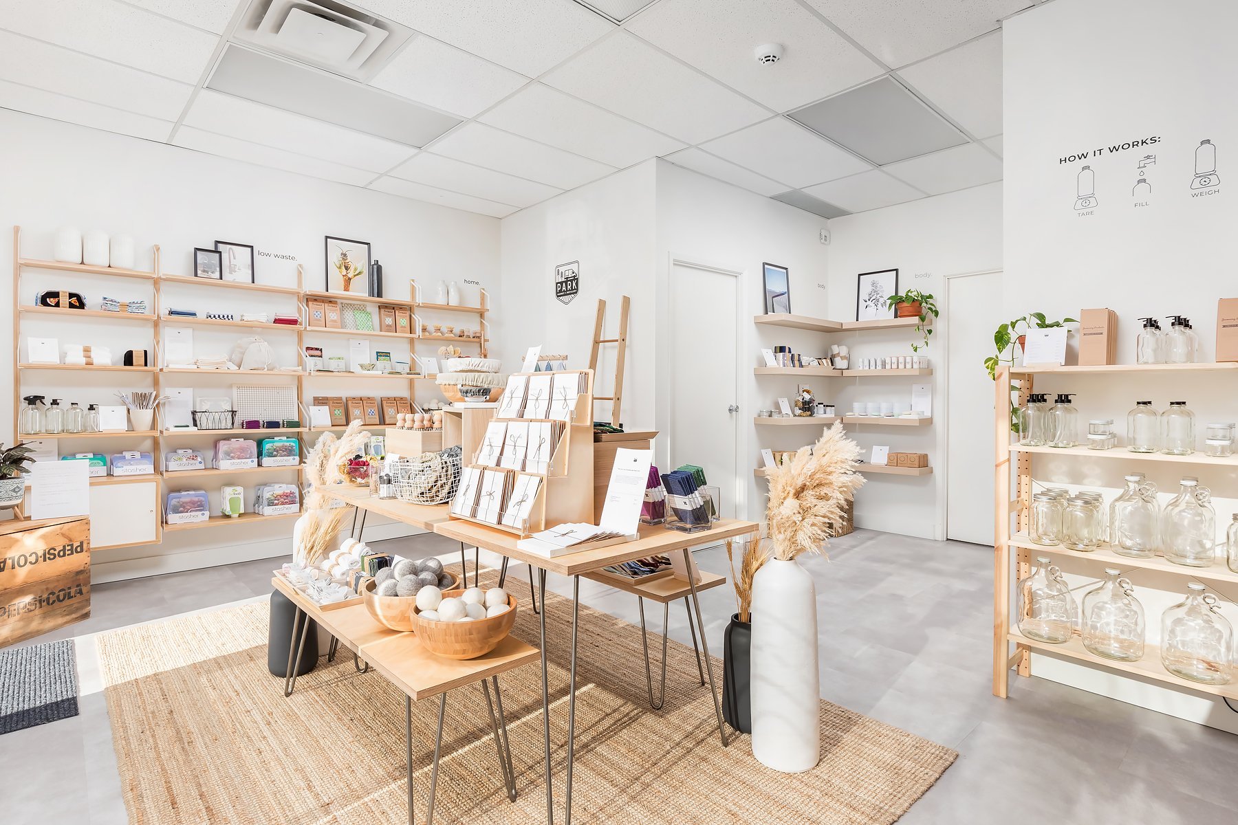
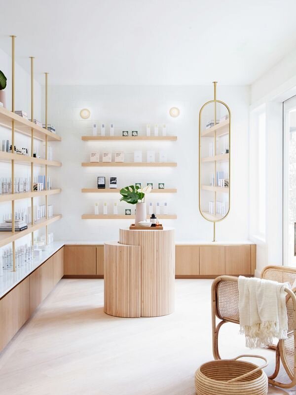
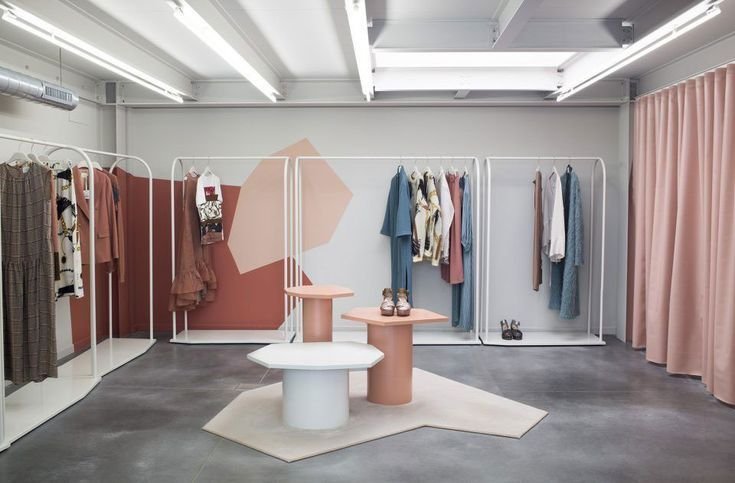
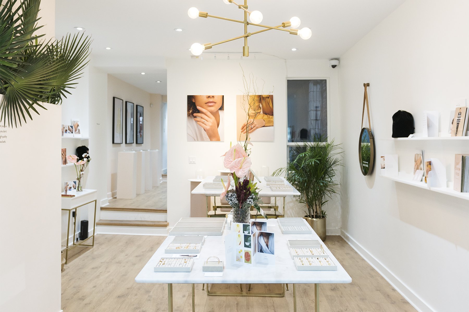
We have so many of our clients asking us how to get a specific look when designing their stores. They come to us with beautifully planned Pinterest Boards (ahh a designer’s dream!), and most of the time, they really follow a clear aesthetic. Today, we want to talk about achieving a beautiful neutral chic look in your store and how to piece it all together!
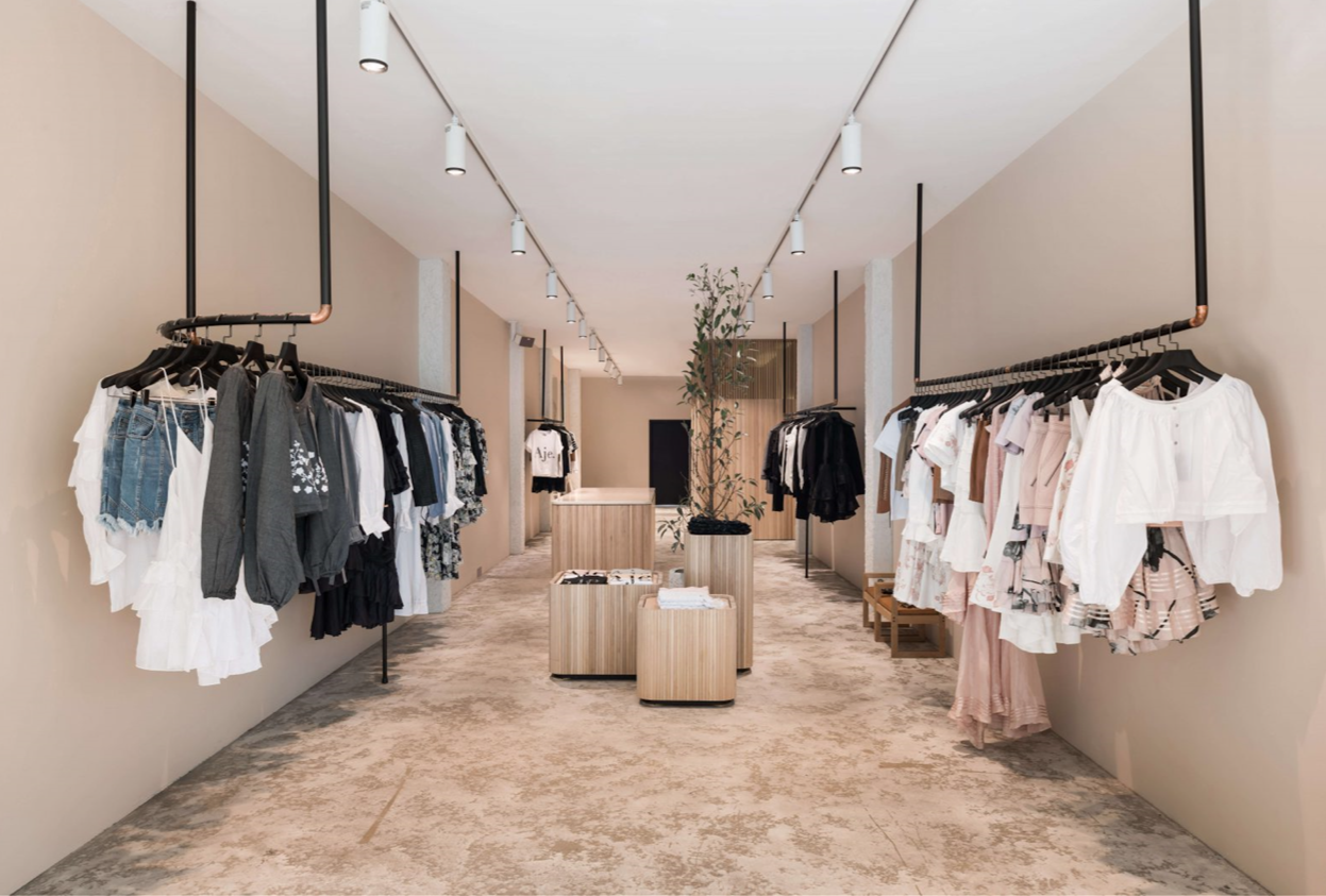
Going for a gorgeous neutral colour palette like beige, white and black is a fabulous way to design a space that is modern and will stand the test of time! It generally acts as a beautiful canvas to whatever products you are selling inside! Having a shop with these tones will also help your clients feel calm and comfortable while shopping. Keep in mind also, that lighter colours will help make your space feel bigger and more airy.
We’ve gone ahead and put together a concept board to help you achieve this look in your space! Worried about where to find the fixtures and furniture? We even went ahead and sourced some amazing pieces and included the shoppable links below so you won't waste any time searching for them and you can get designing on your own right away!
Keep in mind that at NOLA Designs, we love working with small-business owners and understand that budgets are often top-of-mind, so we’ve sourced fixtures and fittings that are cost-effective and beautiful!
This post does contain affiliate links. That just means I may receive a small commission when you make a purchase at no cost to you.
CONCEPT BOARD: NEUTRAL CHIC
If you’re going for that smoothe neutral look with light beiges and soft wood tones. Here are our suggestions of what to look for! We are loving these gorgeous black hanging clothing racks which will add a fantastic modern design element to any clothing store. Next, you need fabulous lights! Try these minimal white track lights to make your space well-lit but also creates a higher ceiling effect because the tracks disappear into a white ceiling. It’s also important with this design, to have some form of greenery in your store, we love this gorgeous faux tree, all you have to do is dress it up in a pretty neutral coloured planter. Your next step will be to dress up your space with display tables and for this concept, we suggest going with this mid-century modern natural wood table. To create depth in your displays, we also suggest using these lower contemporary wood tables to feature some special products throughout your store. Oh and we can’t forget your floors! When going with this neutral tone, we suggest choosing a gorgeous floor tile that is both easy to install and long lasting for lots of foot traffic! Last but not least, we would suggest choosing a soft neutral beige for your walls. Our pick would be Benjamin Moore’s AC-28 North Hampton Beige.
We hope this helps you in your design process, we would absolutely love to hear from you and see how your space is coming along. Tag us on IG @noladesigns_ with your photos and share your shop design with us! If ever you need any assistance or support while designing your store, we know this is a big task, so feel free to reach out to our team or book a discovery call.
The Nola Designs team
